Align design and engineering around a single source of truth
•
Improve design-to-development handoff efficiency and reduce clarification cycles
•
Enable faster experimentation and feature delivery without sacrificing quality or accessibility
Impact
•
Time to market: 2x faster delivery of new features and experiments
•
Consistency & trust: significant reduction in UI inconsistencies across product and experimentation surfaces
•
Scalability: System components and tokens became default for new features and experiments
context
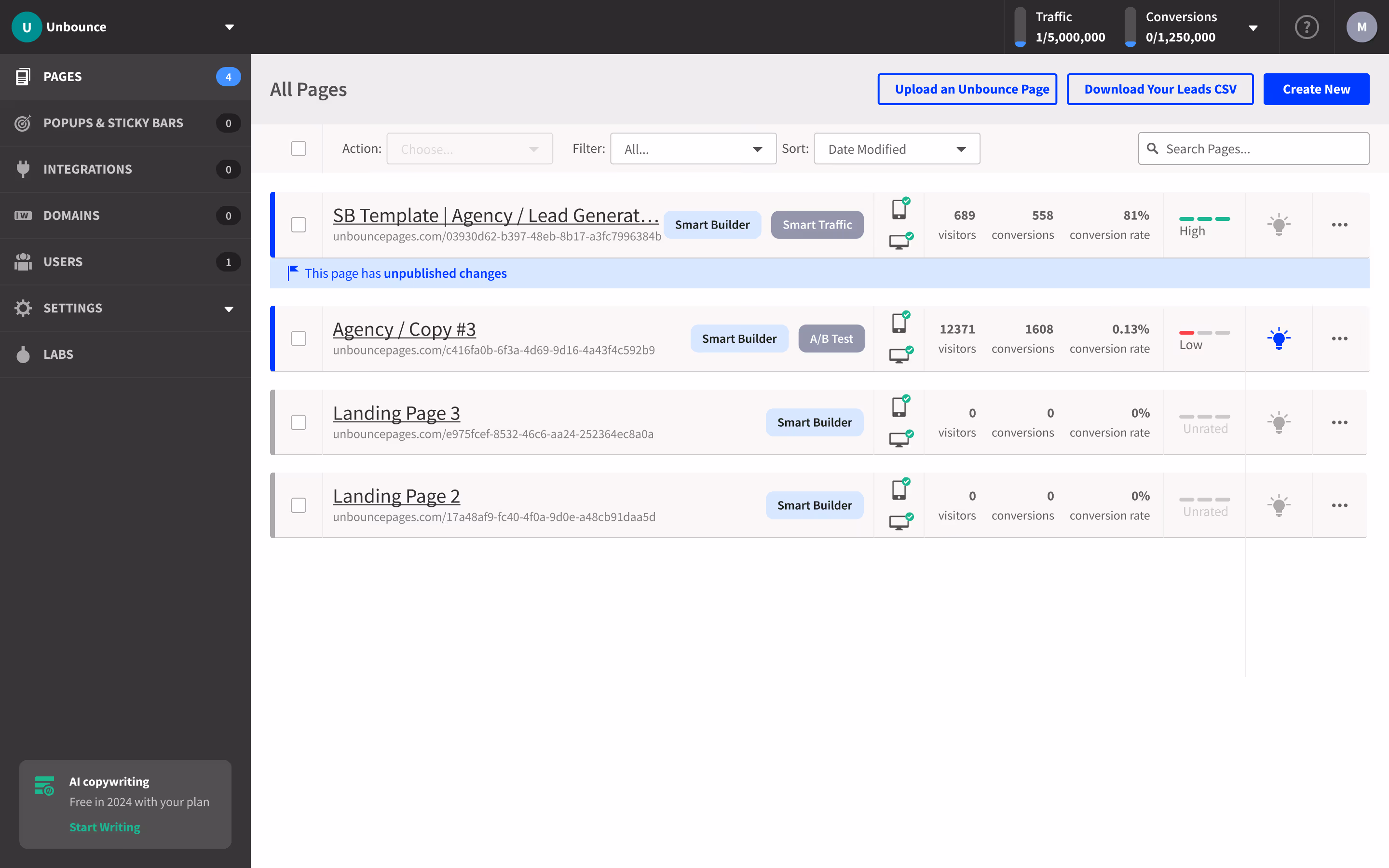
As the product scaled, design and engineering workflows evolved at different speeds. While the design team relied on a lightweight style guide, engineering was shipping quickly and building UI components to keep up with delivery demands.
Over time, this created misalignment between design intent and implementation, making it difficult to scale the product consistently.
Pain points
Style Guide without integration
Visual style guide existed, but it functioned as a design-only artifact rather than a shared system.
•
Provide contextual recommendations.
•
Provide contextual recommendations.
Style Guide without integration
Engineering teams were shipping quickly, but components were created in the context of individual screens.
•
Provide contextual recommendations.
•
Provide contextual recommendations.
Style Guide without integration
Design and engineering maintained style guide separate and increasingly divergent libraries.
•
Provide contextual recommendations.
•
Provide contextual recommendations.
Style Guide without integration
As duplication increased, delivery time per feature gradually increased as well.
•
Provide contextual recommendations.
•
Provide contextual recommendations.
Research
Collaboration with a stakeholders is key to a successful design system:
•
Design Team: easy to use and meets their needs
•
Development Team: design system integrates smoothly with the development process
•
Product Management: design system can support product initiatives
Initiatives
Style Guide without integration
Align design and engineering around shared expectations and constraints.
•
Provide contextual recommendations.
•
Provide contextual recommendations.
Style Guide without integration
Reduce guesswork and rework during implementation.
•
Provide contextual recommendations.
•
Provide contextual recommendations.
Style Guide without integration
Improve inconsistency, velocity, and long-term maintainability.
•
Provide contextual recommendations.
•
Provide contextual recommendations.
Style Guide without integration
Define a single, scalable source of truth for components and patterns.
•
Provide contextual recommendations.
•
Provide contextual recommendations.
Structure & Planning
System Structure
The design system was planned and rolled out incrementally to support rapid experimentation while ensuring long-term scalability and maintainability across teams.
Planning, Adoption & Maintainability
To avoid disrupting active product work, the system was introduced alongside ongoing feature development rather than as a standalone initiative:
•
Conducted a UI and component audit to identify duplication and high-impact opportunities
•
Prioritized frequently used components tied to core product and experimentation flows
•
Co-designed components with engineering to ensure feasibility, performance, and adoption
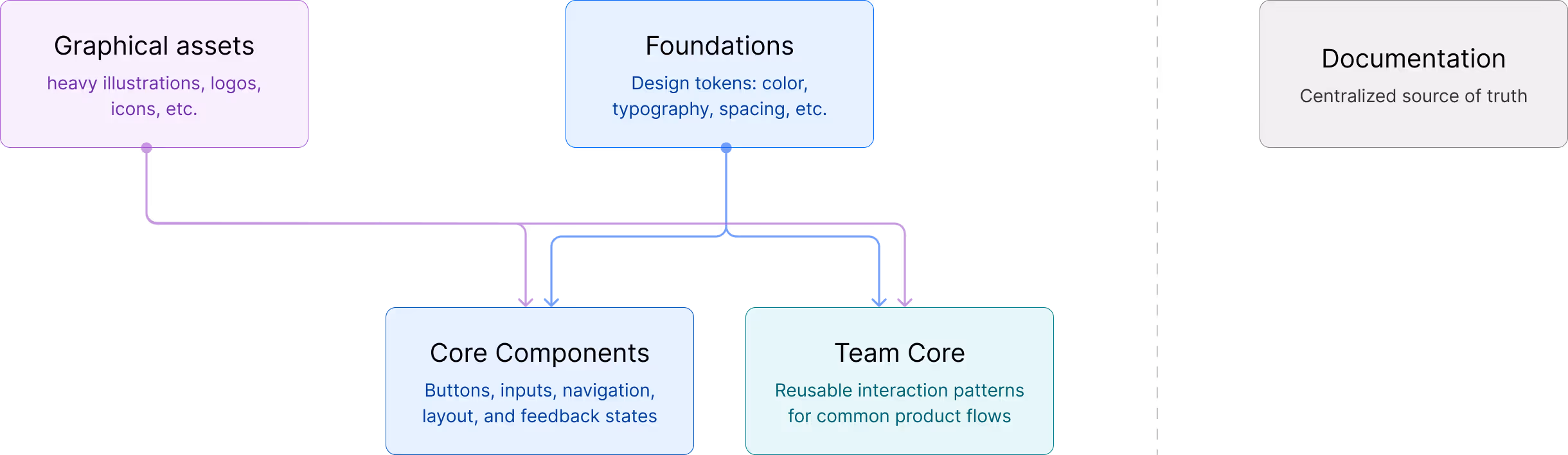
foundations
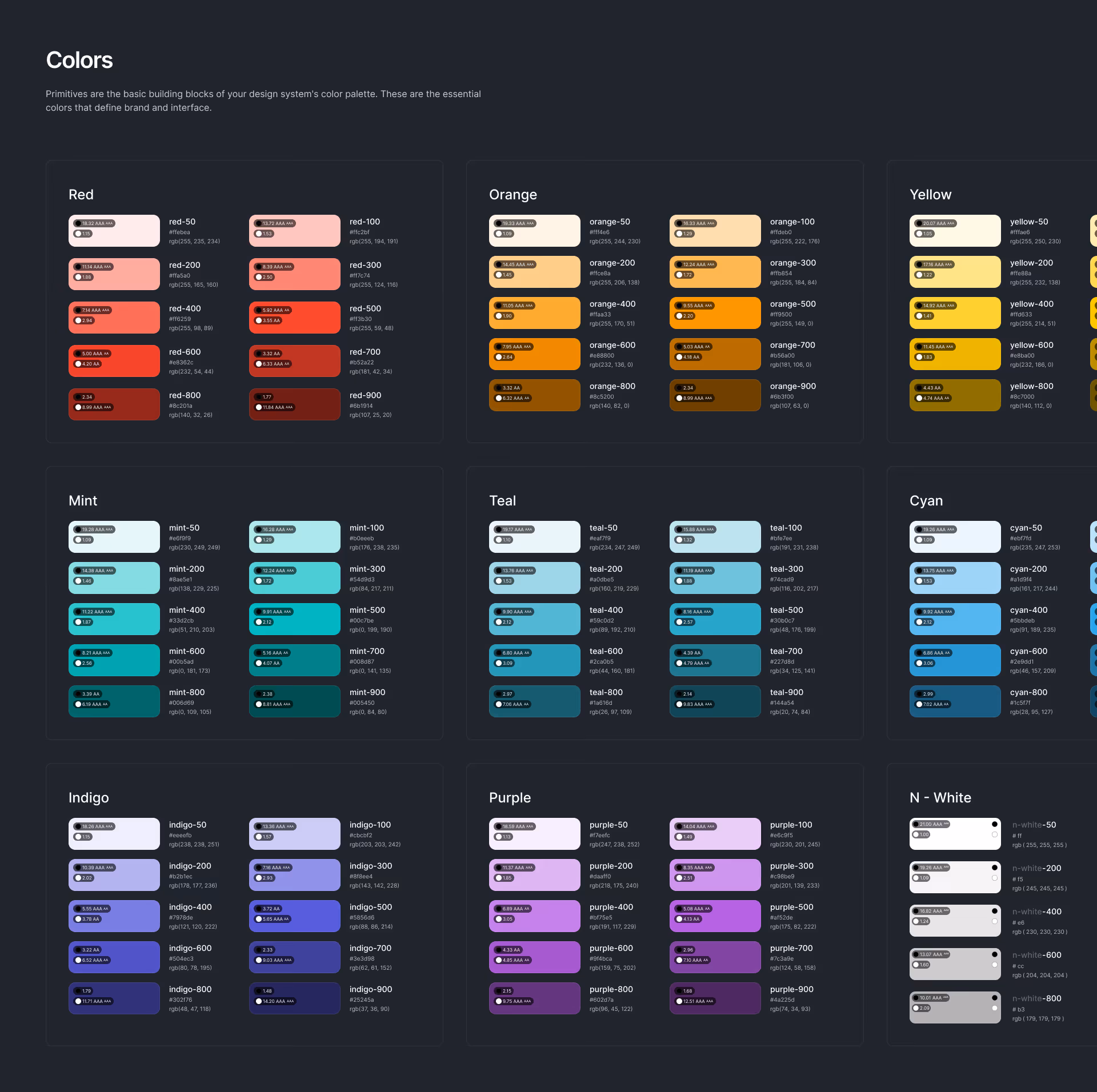
I audited the existing design libraries and restructured them into a foundation-level hierarchy defining color, typography, spacing, and elevation creating a scalable base for consistent component design and future evolution.
Graphical assets
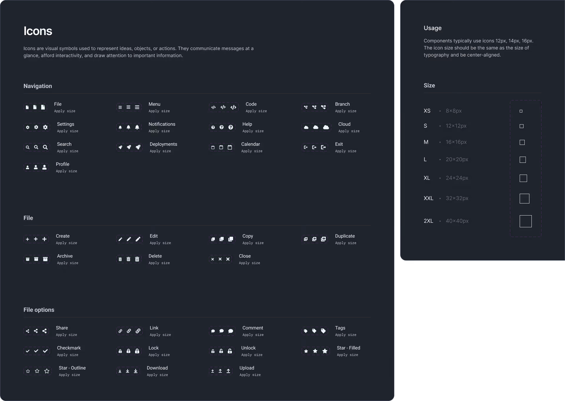
Graphical assets were centralized into a single library designed to cover all product needs and evolve alongside the product. Icons, illustrations, and supporting visuals were reviewed, standardized, and updated as new use cases emerged.
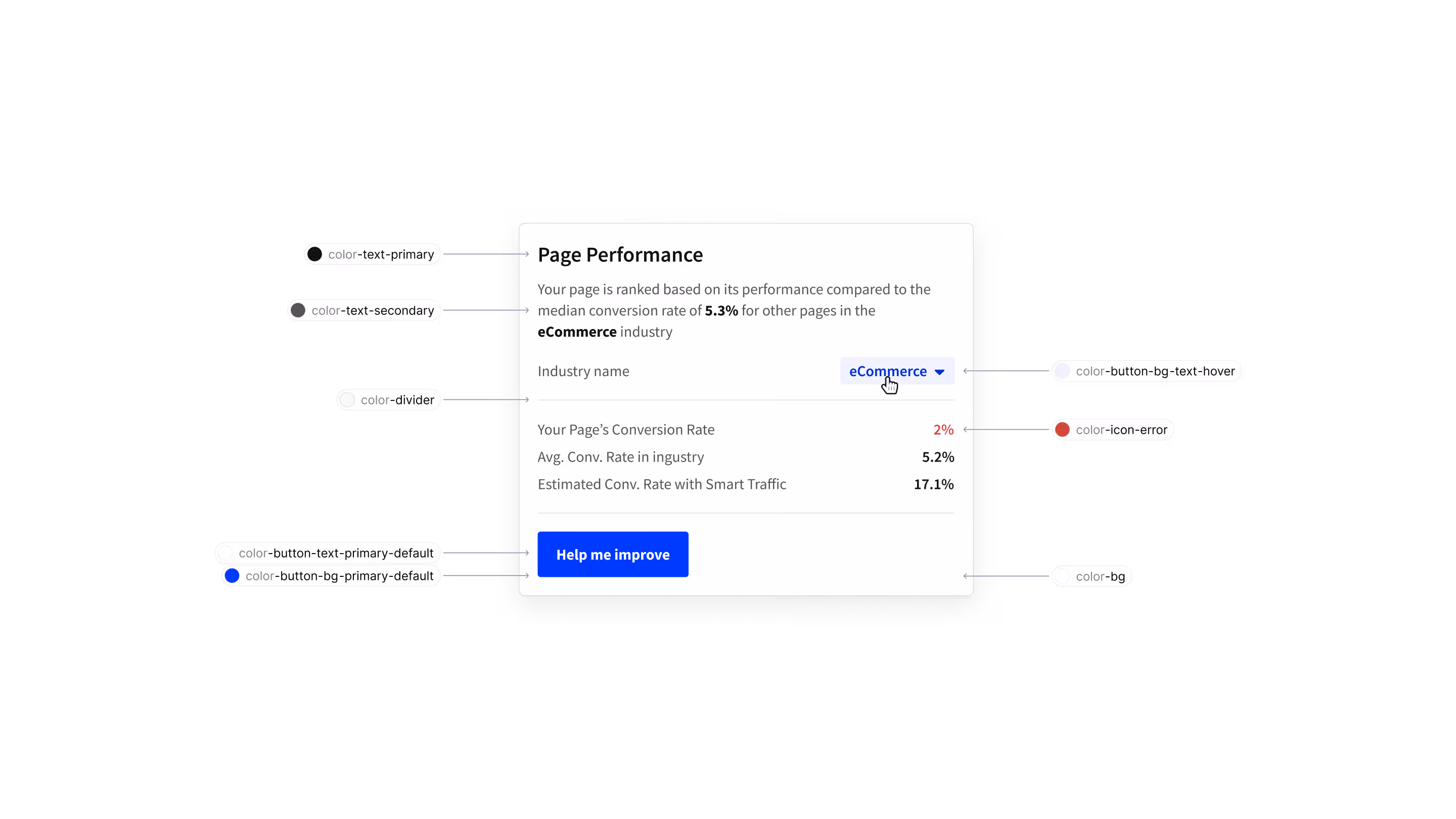
Tokens
Hierarchy
Tokens were structured in a layered hierarchy to balance flexibility and control:
•
Global tokens: Raw, brand-level values (e.g. base colors, font families)
Component tokens: Context-specific overrides scoped to individual components when needed
Token Governance
To keep the system maintainable as teams scaled, clear governance was established around token creation and usage.
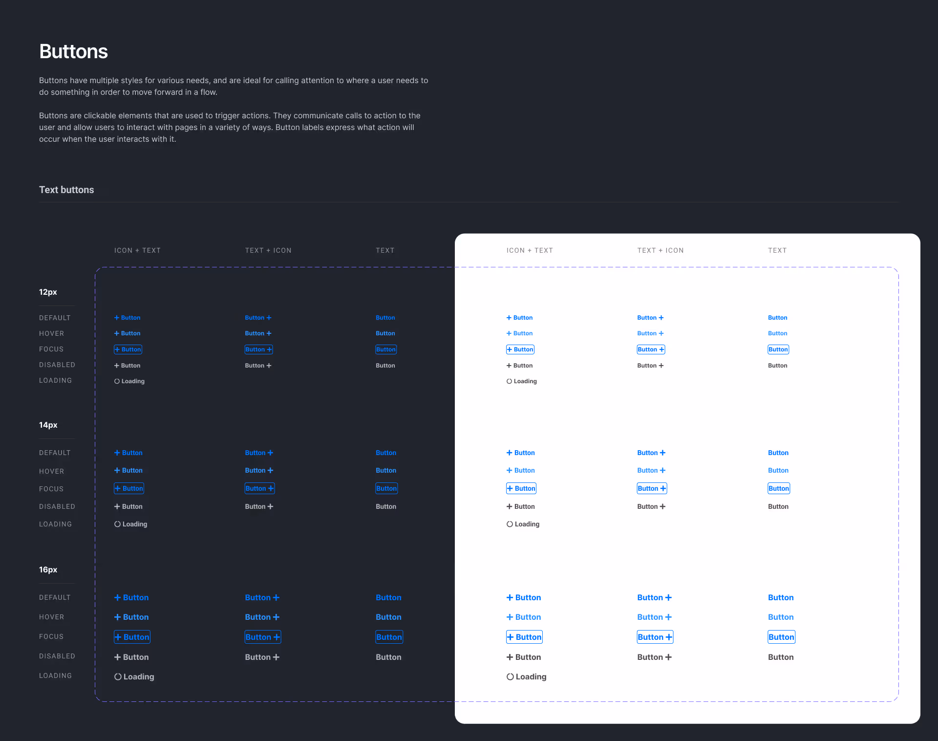
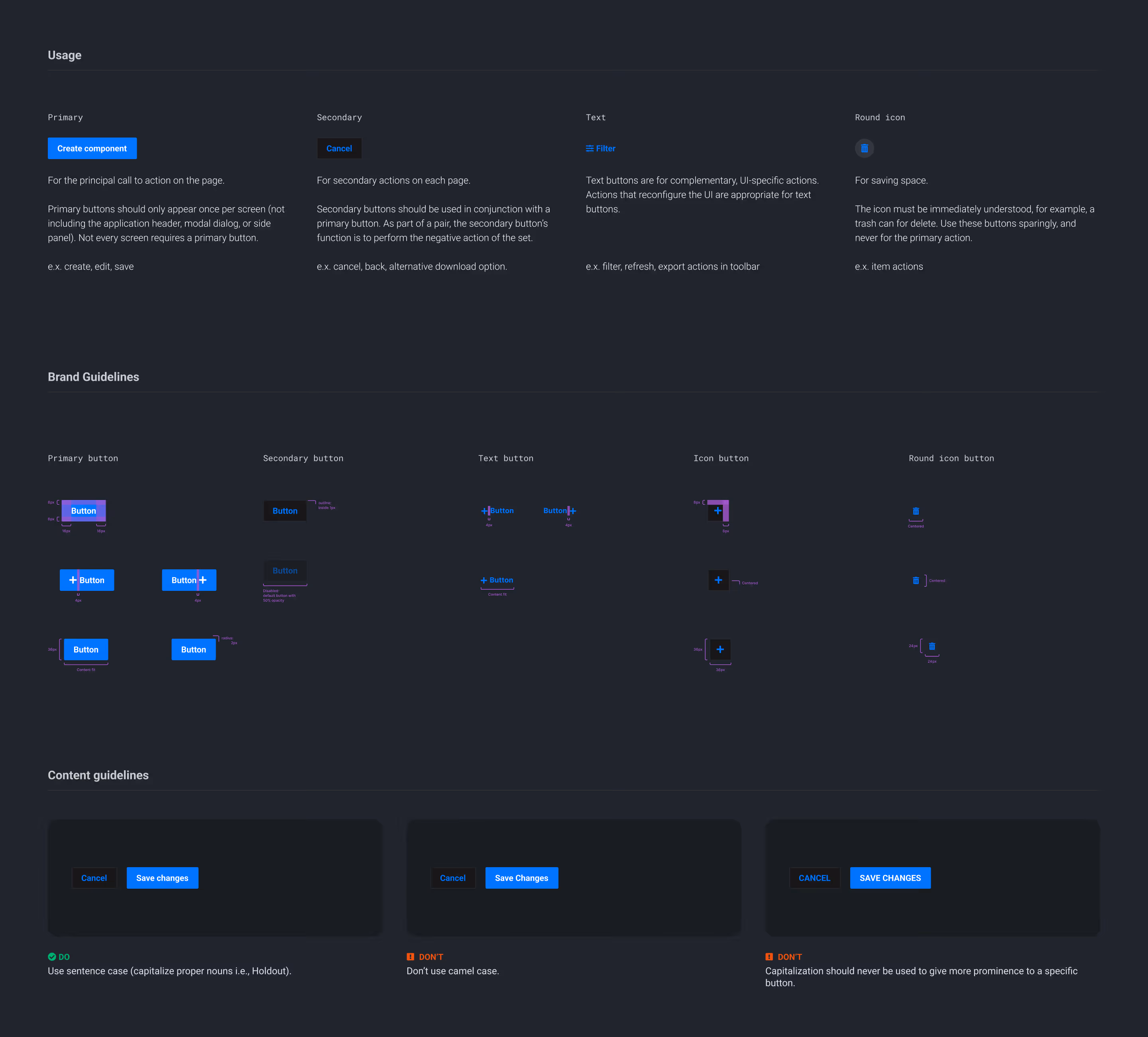
Components
Components were designed as reusable, composable building blocks that balanced consistency with the flexibility needed for rapid experimentation.
Key principles guiding component design
Reuse over duplication
Prioritized common use cases to maximize adoption.
•
Provide contextual recommendations.
•
Provide contextual recommendations.
Extensibility
Components supported variations through props and configuration rather than custom forks.
•
Provide contextual recommendations.
•
Provide contextual recommendations.
Extensibility
Components supported variations through props and configuration rather than custom forks.
•
Provide contextual recommendations.
•
Provide contextual recommendations.
Accessibility by default
States, interactions, and contrast were built into the base component.
•
Provide contextual recommendations.
•
Provide contextual recommendations.
Design–Engineering alignment
Components were designed and documented alongside their code counterparts.
•
Provide contextual recommendations.
•
Provide contextual recommendations.
Documentation
Documentation
Documentation was treated as a core part of the design system, not a secondary deliverable. Its purpose was to make the system easy to understand, adopt, and evolve for both designers and engineers.
Each component and foundation was documented with:
•
Clear usage guidelines and best practices
•
Do / don’t examples to prevent misuse
•
Accessibility considerations and interaction states
•
Design and engineering references aligned side by side
By investing in clear, practical documentation, the system became self-serve reducing clarification cycles, improving consistency, and accelerating onboarding for new team members.
Development
Design - Engineering integration
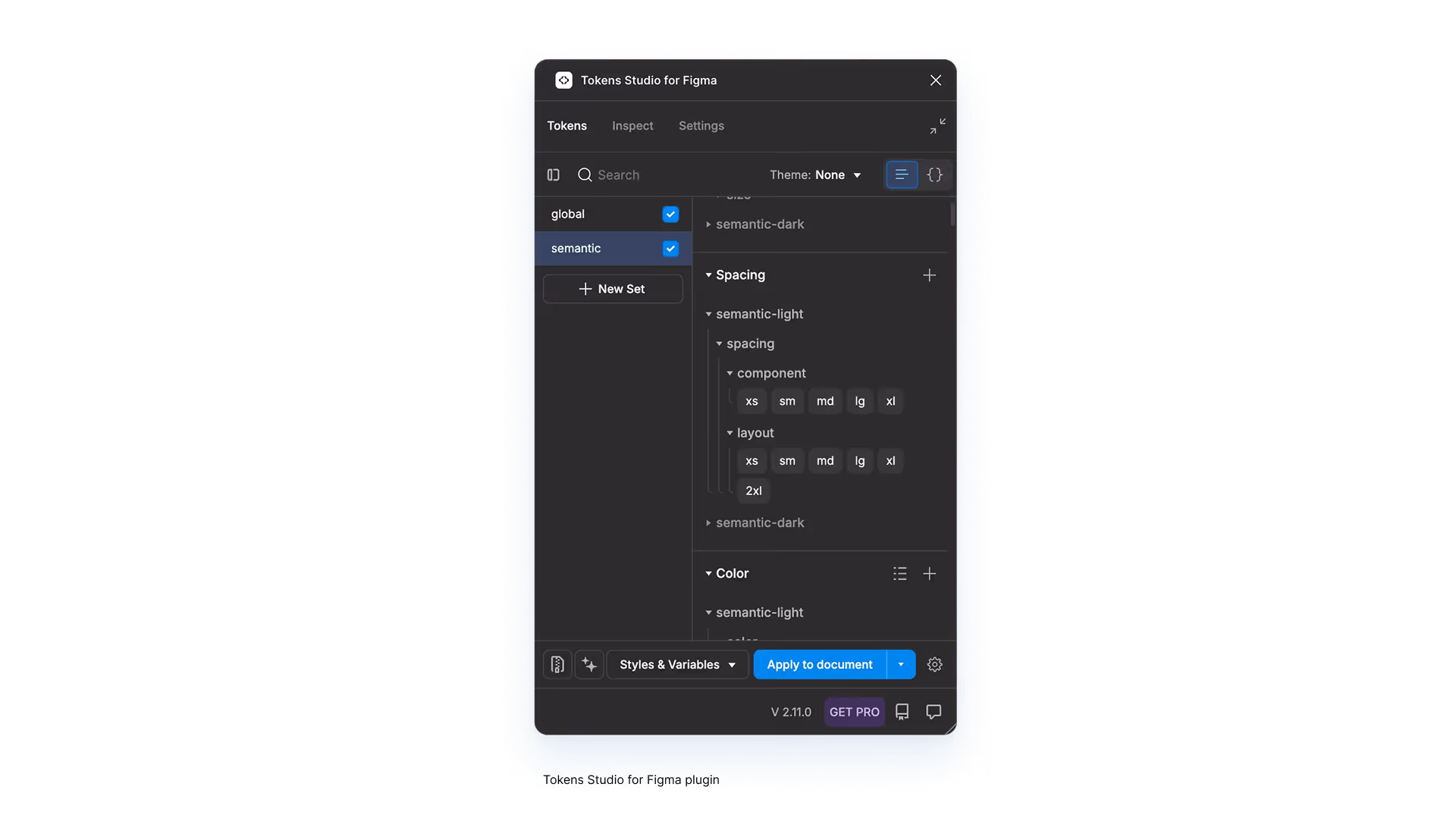
Design tokens were managed using Token Studio, allowing tokens to be structured, versioned, and exported in formats compatible with engineering needs. This created a shared, source-controlled contract between design and code.
Tokens and system artifacts were synchronized through JSON-based sources (GitHub / GitLab for version control).
Results
Results
The design system delivered measurable improvements across design, engineering, and product teams, while establishing a scalable foundation for Unbounce’s continued growth.
2x Faster delivery
Reduced time to design and implement new UI by enabling teams to reuse existing, system-driven components.
•
Provide contextual recommendations.
•
Provide contextual recommendations.
Improved inconsistency
Significant reduction in UI inconsistencies across product and experimentation surfaces.
•
Provide contextual recommendations.
•
Provide contextual recommendations.
Engineering efficiency
Less duplicated component work and fewer implementation assumptions.
•
Provide contextual recommendations.
•
Provide contextual recommendations.
Adoption at scale
System components and tokens became the default for new features and experiments.

