Mick Dubik

total models built
built models daily
valuation
the world’s best cloud company by Forbes


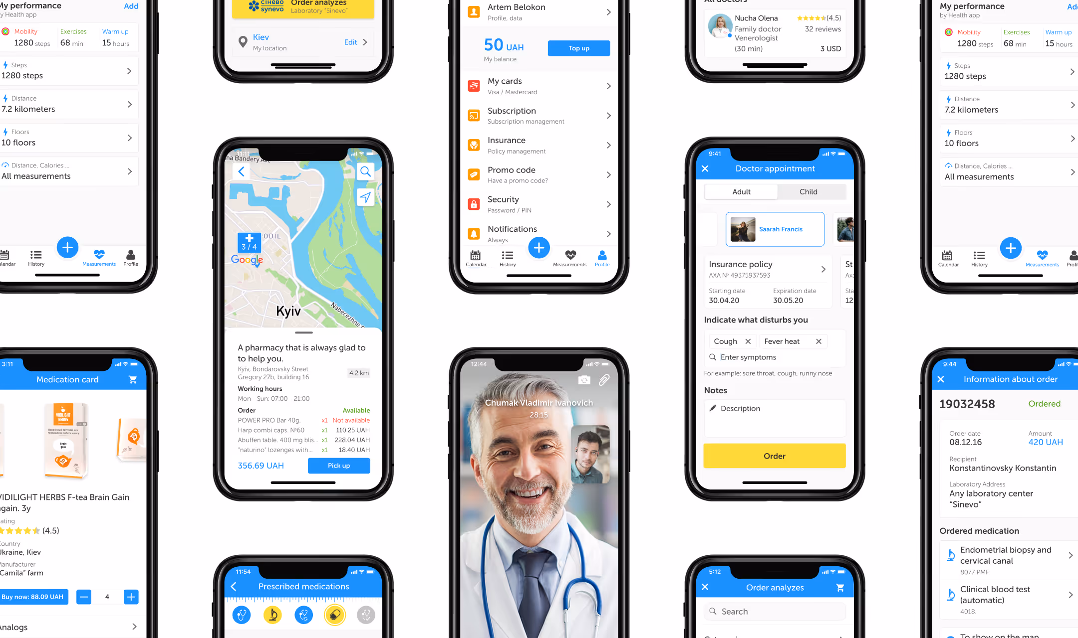
Image: Depicts the transition from three separate development tools to a unified documentation portal.

To ensure the new designs addressed the needs of our primary users, I conducted usability tests.
During these sessions, I observed how participants interacted with the prototype and assessed how effectively it answered their questions about platform usage. The sessions provided clear direction on what actions to take next and how to achieve better results on the DataRobot app.
Agree
“I thought the portal is easy to use”
“I think that I would like to use this portal”
Disagree
“I think that I would need the support of a technical person to be able to use this website”
Overall, the Hi-fi prototype consistently scored above 90 on usability, significantly above the benchmark average of 68, indicating an A grade of user satisfaction.
Key findings:
Users found it easier to understand how features work, locate information, and access helpful suggestions.

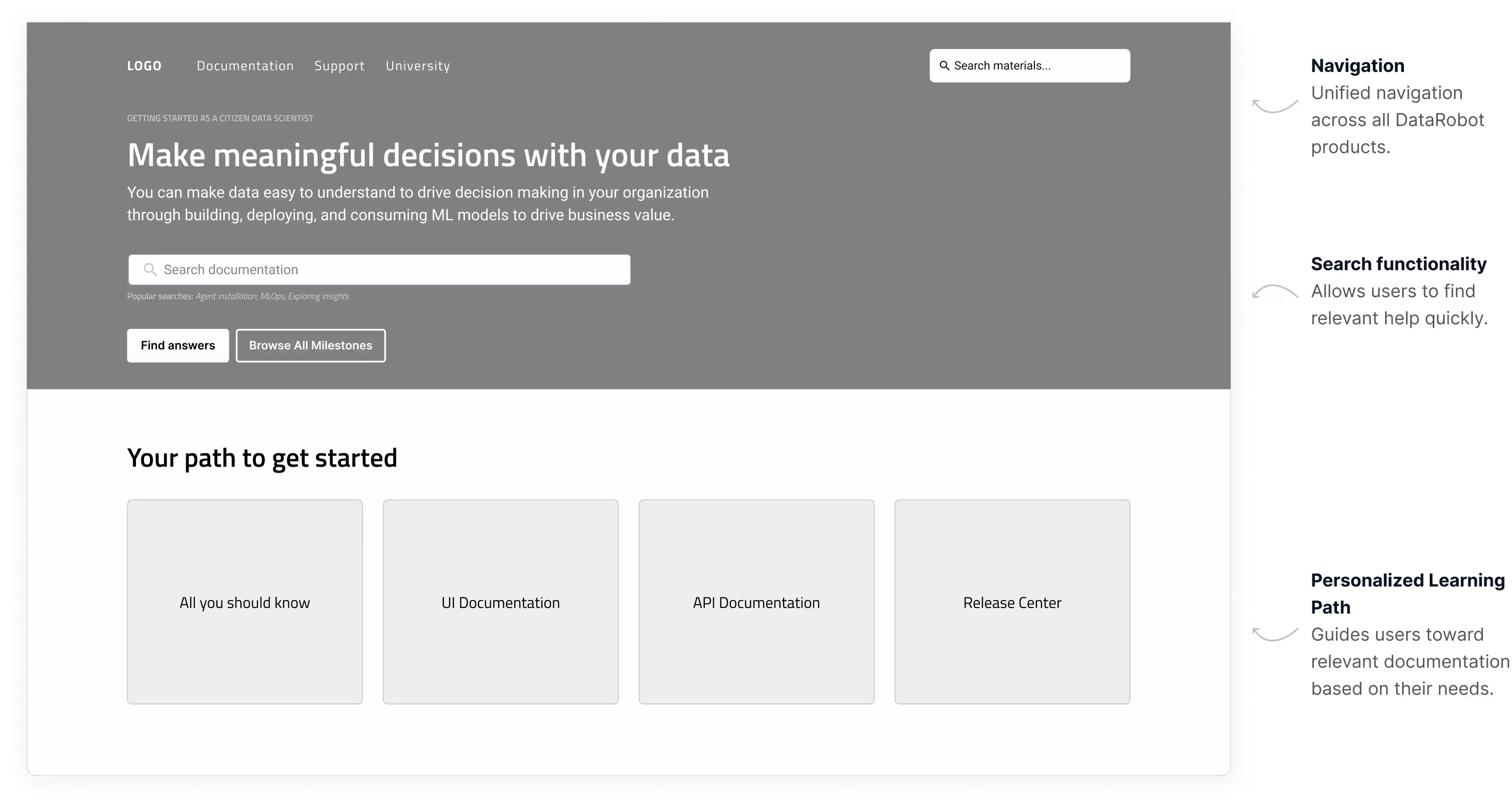
Based on insights from research, customer support requests, and gathered data, I implemented the following key features to improve the DataRobot platform's documentation portal.
The navigation menu includes a documentation link that assists in finding materials when needed.

All new features will have documentation support in addition to deep knowledge features.

The homepage is designed to be both functional and visually appealing, offering four main pathways to guide users. A powerful search function also allows for even quicker access to relevant content.

The cutting-edge search engine offers advanced filtering by sections and categories. A result preview feature highlights relevant text, enabling users to find the most pertinent information without opening multiple articles.

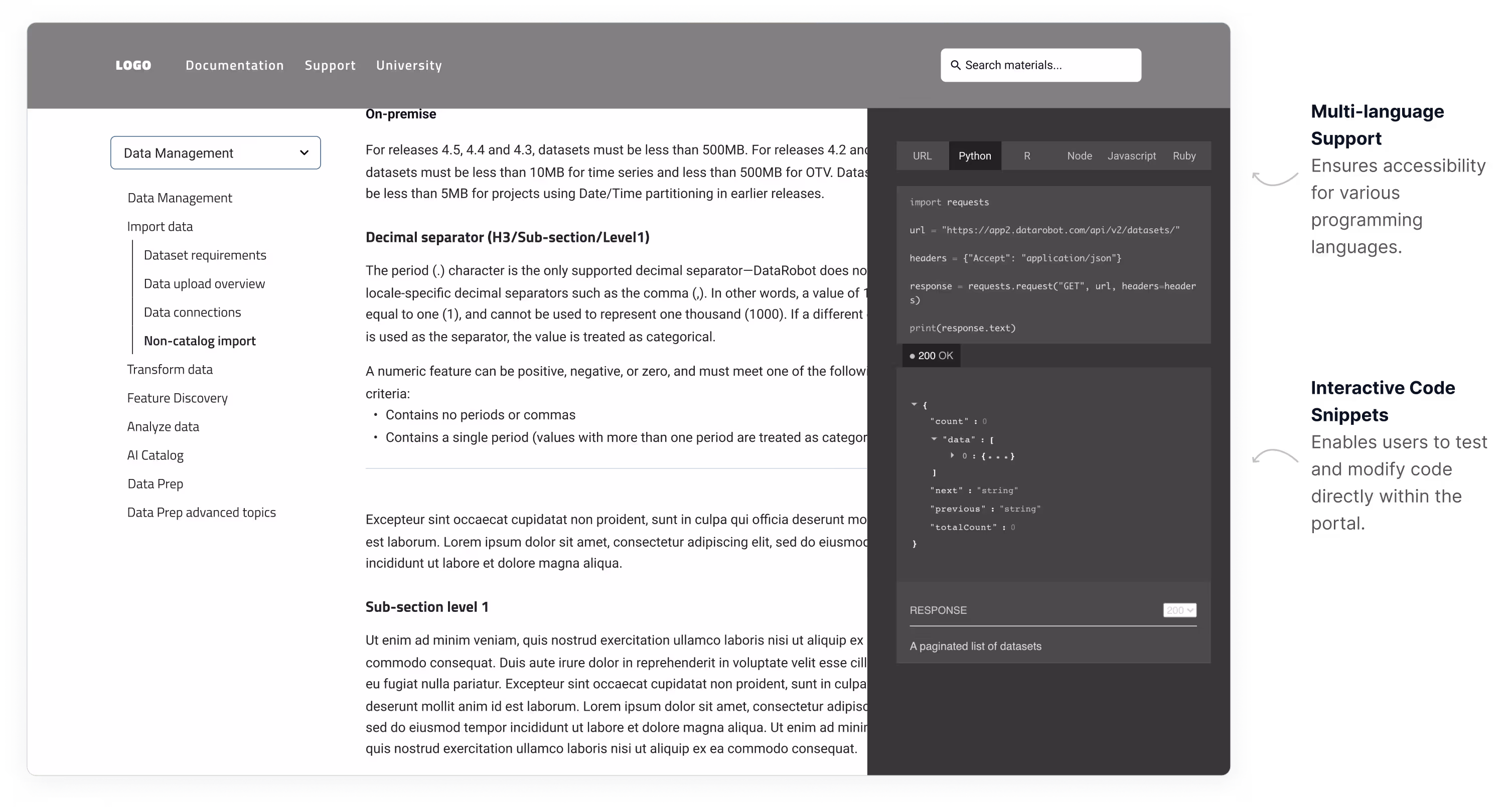
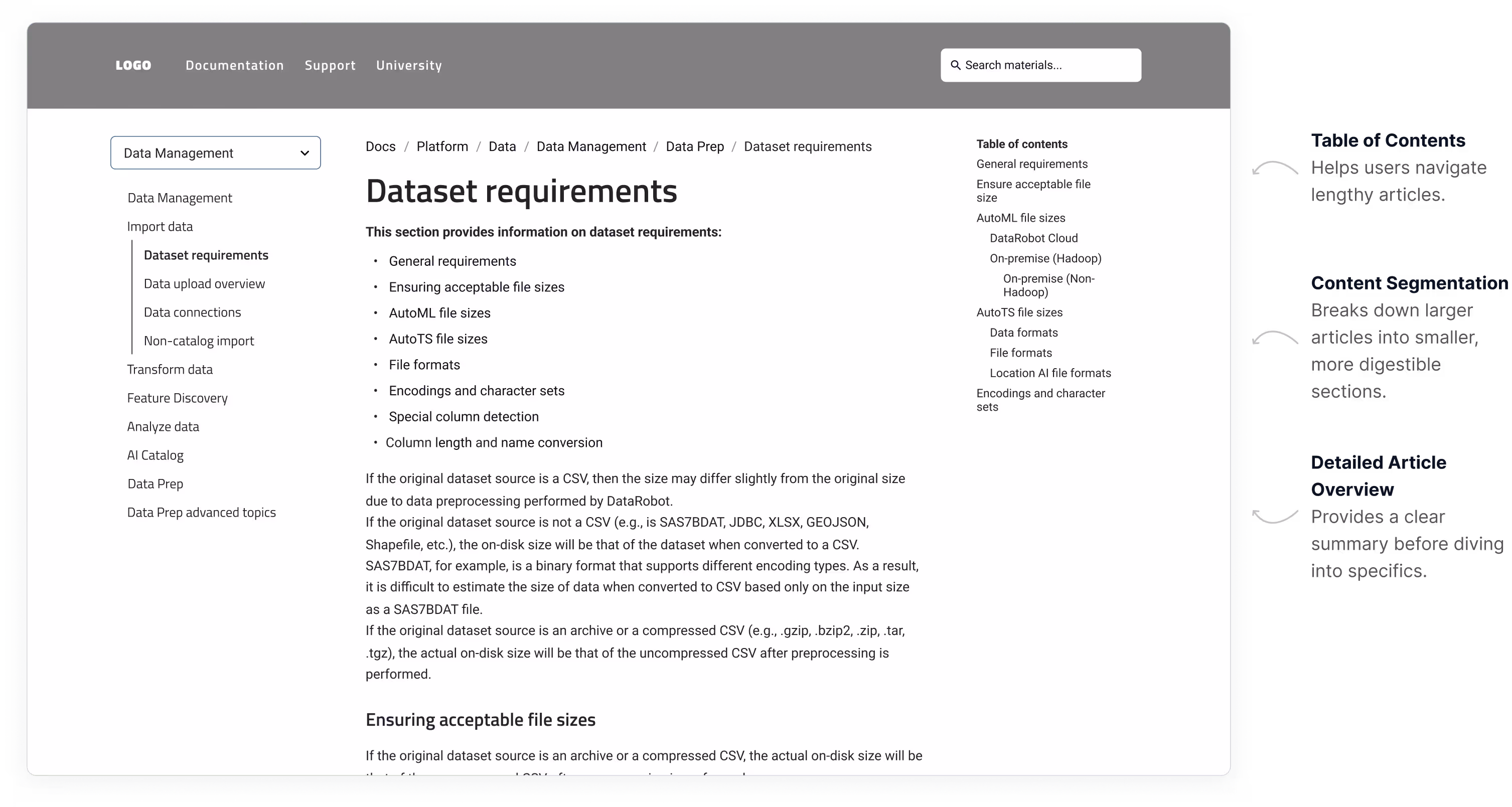
Each article includes a table of contents, allowing users to easily navigate between sections, a feature highly appreciated during usability tests.

Code snippets are linked and grouped by tabs, making it easy for users to copy and paste the necessary code.

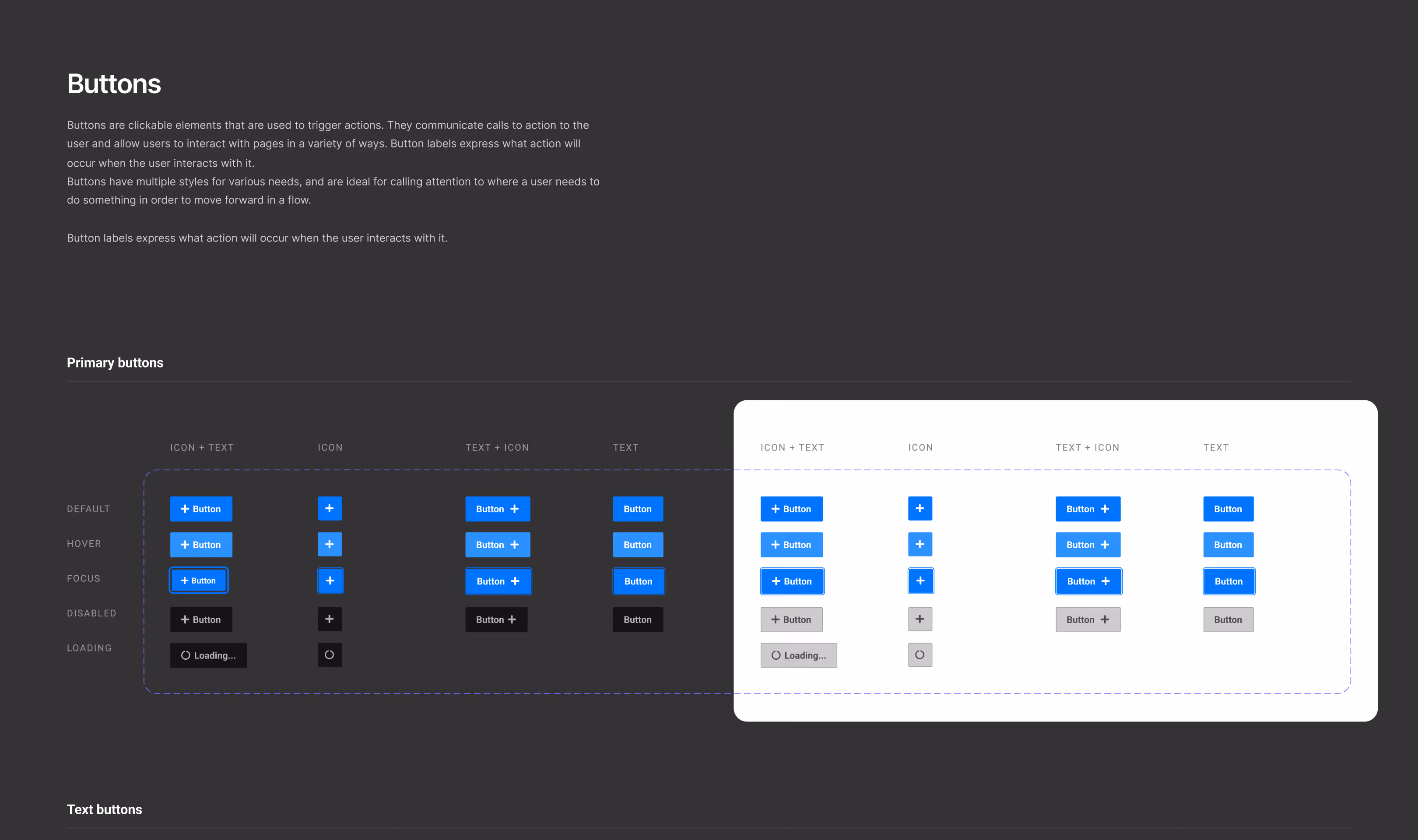
I created high-fidelity mockups in Figma, allowing developers to easily navigate through pages, launch prototypes, and access all exportable resources, including objects, visuals, and styles. Figma’s Code panel supports CSS, Swift, and XML, providing a straightforward way to extract code information from specific page elements.
To ensure the design vision was fully realized, I worked closely with the Front-End team, specifying any missing interactions that weren't covered in the mockups. I also reviewed each development ticket to verify alignment with the designs before going live.

Since the launch of the Documentation Portal, we've seen a significant reduction in user questions about the application, indicating improved user understanding.
Additionally, users have shared that the portal’s use cases have saved them considerable time, highlighting the effectiveness of the resource.
Strategic MVP launch
This helps deal with out-of-scope requests that could potentially derail the project and help deliver a quality product in time.
Continuous user testing
Design is a constant iteration of improving the experience for the end user. Always find ways to collect and listen to your user's feedback.
Focus on essentials
Iteration is the basic timeframe that is needed to develop a digital product. Iteration always includes new features. Thus, it helps you to identify the most efficient tactics in a short period of time.

